This is the third installment of our SBS Online Redesign Blog Series.
This series of blogs has been created to ensure that schools are familiar with the software redesign before it is released. Previous blogs in this series: Blog 1: Login screen Blog 2: Dashboard Next blog in this series: Blog 4: Budget Navigation Blog 5: Planning & Reporting Menu Blog 6: Search Function Blog 7: Edit & Save Button Blog 8: School Details Blog 9: Actions, Filters, Hidden ribbon Blog 10: Report View Blog 11: Monitoring Status Blog 12: Payroll Reconciliation Blog 13: Budget Tabs Blog 14: Budget SettingsPreview of the School Navigation
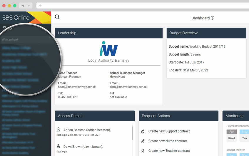
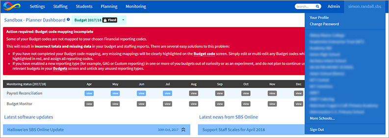
If you have access to more than one planner, moving between them will work in a similar fashion as before but with greater visibility. Currently, to view other schools, the username is selected from the top right. In the new interface users will be able to click on the name of the school on the top left and this will reveal a drop-down menu to allow you to select the school planner you wish to view. This is how it looks currently:

About this blog series
As mentioned in the previous blogs of this series, the redesign of our school budget management software SBS Online will greatly improve the user experience, make financial planning easier and save significant time when navigating across the menus. We have always concentrated on functionality and performance over cosmetics. However we feel that it is about time SBS Online had a bit of a facelift. In preparation for this we will post several blogs from now until the release to give you a taste of the differences and similarities between the current software and the new design.Our support before, during and after release
We are working hard to ensure that the redesign will greatly improve the user experience, make your budgeting easier and save you time when navigating across the software.
It's also very important to us that the update causes minimal disruption to our users. We're excited for you to see the redesigned software in full and we're confident that this series of blogs will ensure that you are familiar with how it looks before it is even released!
The vast majority of menu items and sub-menu page locations will remain untouched. They may just appear in a different layout. We love that SBS Online is simple to use and intuitive and this will remain central to the redesign brief.
On the release day the SBS Online Service Desk team will be on hand as ever to help you with any queries.
Want to find out more?
Book a demonstration →
See the SBS team demonstrating the software live at Academies Show London on 25th April.
Join one of our Budget Management Focus Groups across the country. This will give users the opportunity to trial the redesign before it's officially released, discover top tips about the software and provide suggestions for our development roadmap.
As always, if you have any questions or concerns, please contact the Service Desk on 0345 222 1551 • Option 8 or email sbsonline@schoolbusinessservices.co.uk.
Get sector Insights delivered straight to your inbox.
Subscribe to to the SBS Blog and never miss an update.

